Layout
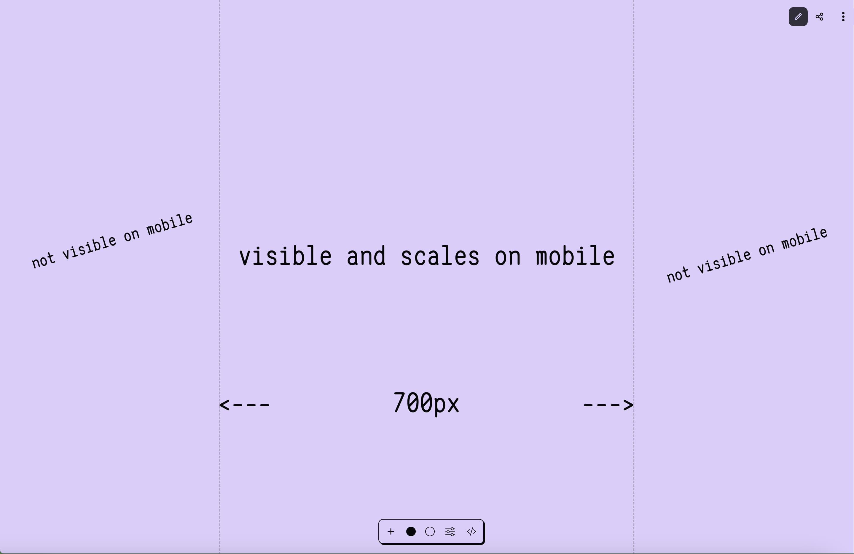
There is currently one layout available in wobble that is designed to make it easy to make websites that look nice on mobile and desktop. Everything inside the guides section of the site is scaled down when the viewport is less than 700px (roughly the average size for small devices at time of writing). Everything outside the guides section is cutoff when the viewport gets smaller than 700px.
For the scaling we use only CSS, by typecasting 100vw to a Number. More info on this technique can be found here.
We plan to support adjustable mobile widths and additional layouts including infinite canvas and zines at some point in the future.